
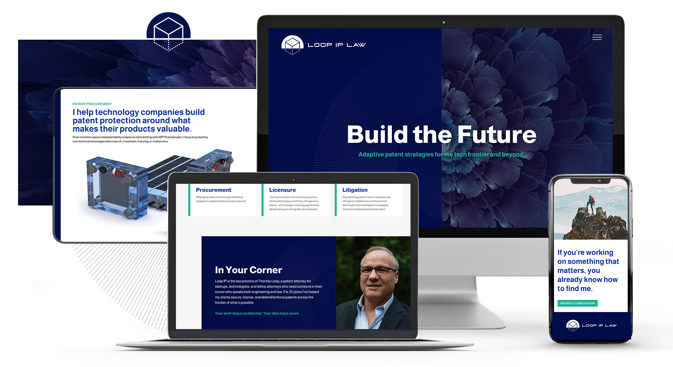
Solo Patent Attorney Launches a Branded Website
Loop IP Law
A lawyer’s website is a calling card. What does yours say about you?
Thomas Loop has practiced patent law in Seattle for more than 25 years. He brings training in chemical engineering and physics to work at the edge of technology, from fuel cells to photonics, and he handles the full life of a patent: procurement, licensing, and litigation in federal court. Few patent attorneys do all three. Nearly all of his work comes by referral, so he didn’t need a website to bring in clients.
He did need one he wasn’t embarrassed by. His old site was a template built for search engines, with long blocks of SEO copy, a generic look, and a description of his practice that missed what he actually does. Meanwhile, newer firms in his space were looking sharp online. His site needed to up its game.
The calling card
For an established solo law firm, the website rarely makes the introduction. A referral does that. The website is where the referral goes next, along with the investor doing diligence and the opposing counsel sizing up who they’ll face. It does the job a downtown office lobby used to do, telling visitors who you are before you say a word.
Thomas is a sophisticated attorney with real swagger. He can be a patient guide for a first-time inventor, and he can go to battle in federal court; he describes his practice as sword and shield. No visitor was going to read their way to that. They needed to feel it the moment they arrived.
People respond emotionally to colors and images
Thomas brought a lawyer’s natural skepticism to marketing and design, but the kickoff caught his imagination. As we talked through his practice, he began describing it in images: scaffolding, the layered growth of a nautilus shell, the patterns of ferns and fractals meeting the precision of engineering. That’s how he thinks about a patent portfolio, built deliberately in layers that grow over time.
That metaphor became the site. The homepage opens on a split screen, with an abstract, flower-like form unfolding beside the headline and fine technical linework running through its organic shape. The split echoes the symmetry of his logo, and the palette stays in his blue.
A homepage that plays like a deck
Below the hero, his story unfolds in full-screen panels, lightly animated, that move almost like a slide deck: one idea per frame, from who he is to procurement, licensing, and litigation. There’s very little text, no blinking phone number, and no “call now.” The restraint is the message, and the closing call to action says it best: “If you’re working on something that matters, you already know how to find me.”
A website worth sending people to
Thomas now has a site he’s proud to point people toward, one that matches the reputation he spent 25 years building. If your solo practice has outgrown its website, we’d like to hear from you.
Let's Begin
Get in touch to talk about your project!