Skip navigation

 Branding Agency in Seattle - Branding Process

Practical Branding:

4 Week Branding Process Explained: What To Know in 2025

How do people perceive you? Your logo and brand elements work together to create a feeling.

Inspire confidence and pride. And help you compete.

let's do this

Naming, Mission, and Message

“The difference between the almost right word and the right word is a large matter — it's the difference between the lightning bug and the lightning.” — Mark Twain

As a branding agency in Seattle, we often in the position to help our clients choose - or create - effective, memorable names for products, services and companies. Names that evoke, inspire, and make an impact.

We work with clients to clarify mission statements and to create taglines that capture your values and value proposition. We help shape copy and scripts that grab attention and help you stand apart in a crowded field.

Logo Design

Your logo becomes a focal point for all your work. For prospective customers, it inspires confidence and showcases your authority. For employees and recruiting, it’s a source of pride and inspiration.

As a Seattle logo designer, we've used our 4-week practical branding process (see below) to develop logos for dozens of clients.


Print + Digital

Beautiful marketing materials show prospects and fans that you share their values and value their relationship. They make a gorgeous first impression and a powerful leave-behind for sales visits.

We create advertisting campaigns for print and digital, large-format for events and tradeshows, and gorgeous collateral, from business cards to glossy brochures.

Our branding work...

Branding Process:

4 Week Branding Process Explained: What To Know in 2024

How to create a practical brand for your company.

This guide will outline our practical approach to branding in Seattle.

Not $50,000 conceptual modern art. Not psychoanalysis of color theory and typographical history. Nor will we be repurposing clip art, or farming the work out to an army of overseas designers that never met you or your company.

But rather this is a pragmatic, four week approach to creating a cool, original and business-changing brand, color palette, and logo, for well under $10,000.

We call it practical branding.

1 / 5

Week Zero: It Begins

Exploration: Kickoff and competitive review with Creative Director, Designer, Project Manager
 
Yes we started counting with week zero. Is that cheating? I don't think so, but...

The process begins with a creative kickoff meeting. Our creative team gathers with stakeholders on your side to establish aesthetic and strategic goals.

We talk about your company and your vision. We work with you to define where you want to make your mark. We look at your peers and competitors, and brands you admire. This work will define your place in your industry.

The Right Brain
Branding is largely about emotions. More than mission, vision, and values, but this: How do you want people to feel when they think about your brand? We’ll discuss the emotional and competitive values your brand represents to its founders, to its employees, to its customers and clients, even to its competitors.

Every brand’s values are different. Do you want to be perceived as innovative or traditional? Casual and approachable? Or sophisticated and aspirational? Sporty or elegant?

We'll talk about this and about your customers. Look at other brands in your space. And start thinking about typography, colors, and the logomark.

The Left Brain
A logo does not tell a story, all by itself. The best logos evoke something but they don't do the heavy lifting. That comes from your messaging — and primarily your website. But it can tell one part of the story. It can at least evoke something.

Even our most abstract logo concepts began with a tangible image. What is it?
We'll talk about what your company does. Who it helps. The story of its founding. Its context. We are looking for that one tangible THING. That concrete image that we can use as a jumping off point for a logo concept.

A logo isn't going to tell the whole story of what your company does. But it can bring focus to that story. It can serve as an emblem, a stand-in, a focal point for the story.

Some brands don't include a logomark at all. Sometimes a simple, gorgeous font is all you need. But at this stage of the branding process, we want to dig deep. We leave no stone unturned. We ask a lot of questions, in the hopes that the magic thing we're looking for is just around the next corner.

Inspiration + Aesthetics
Part of this process is looking at logos and brand designs of others. Some designers ask you to create a mood board or Pinterest board as a way of getting to know you. We love a good Pinterest board, and you're welcome to include this in your onboarding materials. But we have another way to establish your taste and preferences that we find is more effective.

We find it is very helpful to review trendy or cool or interesting or ugly logos that are out there on the Internet — that are current — and get your feedback.

This helps us to identify a common visual language which will assist as we develop our own deliverables. If we know for example that you dislike logos with fruit in them, that rules out an entire direction that we don't have to explore. If we know that you like serif fonts but only in all caps it shines a light on where to go and where not to go.

Inspiration logos also serve to loosen up the conversation. It's fun and constructive to critique the work of others as a way to find common ground. Sometimes we meet with clients who don't really have an opinion. That's okay too. But if you can give us a clear sense of your taste, it saves time. And you know what they say: Time is money!

So give us what you can. We’ll take your opinions to heart. And we’ll get to work.

2 / 5

Week One: Creative Logo Exploration

The next phase of the logo design process happens behind closed doors.

It has to, because our designer is digging deep and searching for that elusive something that will become the spark of your brand. The creative freedom to explore every direction and every idea – even the bad ones. Because sometimes a bad idea sparks a good one — and we want to explore every possibility.

This is usually the longest phase of work. You generally won't hear from us for a bit while the designer explores options and we internally bounce them off each other and iterate as a team.

But this work isn't done in a vacuum. We meet and discuss the designs as they evolve. Our biggest focus at this point is selecting ideas that may be worthy of further exploration and exploring them.

Early ideas trigger later ones, design concepts get revised and refined until the most promising concepts rise to the surface and present themselves.

Your creative team meets again, and selects the strongest ideas. We usually focus on 3 to 5 and we make them as different as possible. Each individual concept will include one idea that becomes the select. A single concept selected for its potential. In addition there may be two or three secondary ideas presented which are alternates. These alternates represent offshoot ideas which we aren't ready to discard yet.

We organize a presentation into 3 to 5 concepts, each one with a few alternates. Again around every vision before you see everything to make sure that it meets our standards then we prepare for the unveiling of these initial concepts.

3 / 5

Week Two: First Logo Design Presentation

The presentation of your initial logo concepts is an exciting event. Chances are, you will see the logo among this set that – with some revision — will become the core of your brand.

We generally do this presentation live on zoom. We like to get live feedback and we really value the process of explaining the logo, assessing your reactions in realtime, and discussing our ideas as we present them.

In this presentation you will also see a first round of collateral mockups. These are creative implementations designed to help you visualize what the local logo will look like in the wild. We might include a visual of one concept on a mug. Another one on a billboard. A third on business cards and letterhead. This is not random, but is designed to help us see how it will look in different contexts, and to see the relative strengths and weaknesses of each concept.

The outcome of this presentation

You may choose one concept and say, this is it! It’s great when that happens. But it is not bad when it doesn't. The point of the first presentation is to establish not a final logo, but a direction for further exploration. You may choose one or two different concepts and like different things about them. Remember we are still exploring and refining. So we have plenty of time to choose the font of one concept and pair it with the colors from another and the style from a third.

It's even OK if you don't like anything! Sad but true. If that does happen — and it rarely does, but sometimes — we go back to the drawing board, with the insights gained from our conversation, and discuss what it is that was missing from the design concepts we presented and what you would like to see.  Your input is essential here — we need to clearly articulate what was missing so that next time, we can bring it! The clearer the communication, the better the outcome.

A word about scope

Our process is designed to give most clients everything they need. That's important to keep the price affordable. But some clients need just a little more. Maybe you haven't thought of everything and want to see another round of exploration. Maybe there is a new stakeholder in the group who didn't come to the kickoff. Or maybe something has changed and you have new insight into your brand needs. That's OK!

However, we may have to have a conversation about scope. If the first design presentation didn't address something critical that you told us we will do it over happily! But if it didn't address something that you DIDN’T tell us, or if there has been a change of direction in the project, or new stakeholders introduced, there may be budget implications in redoing this step. So that's why it's so important that the lines of communication be open from the beginning, and especially in the kick off.

Just like the kickoff the first desing presentation is a critically important design meeting and all stakeholders must be there for it to go forward.

4 / 5

Week Three - Four:  Logo Refinement and Selection 

Over the next two to three rounds of revision we work with you to select the strongest logo concept, refine and revise it till you love it.

If the first design presentation goes smoothly and you like where things are headed, we don't typically do the additional meetings on zoom. It's great to get your real time reaction when things are amorphous or uncertain, but once the design is on track and it's a matter of perfecting, it we don't need to meet in real-time unless you want to.

So we post the additional rounds revision to dropbox or our client extranet and respond to your thoughtful and considered feedback when it comes in.

This really isn't a time to be exploring new ideas. That comes earlier in the process. Refinement and selection really kick in when we know what we are going for, and need to explore options. We can look at color refinement, typography, and variations on a theme. Your logo is going to be with you for a long time and we want to make sure you love it!

In fact those magic words are what we are waiting for. Only when you are able to say I love it! do we go to the final step…

5 / 5

Week Five: Final Deliverables

Once we hear those magic words your brand design process is done. Now it's time to bring it to life.

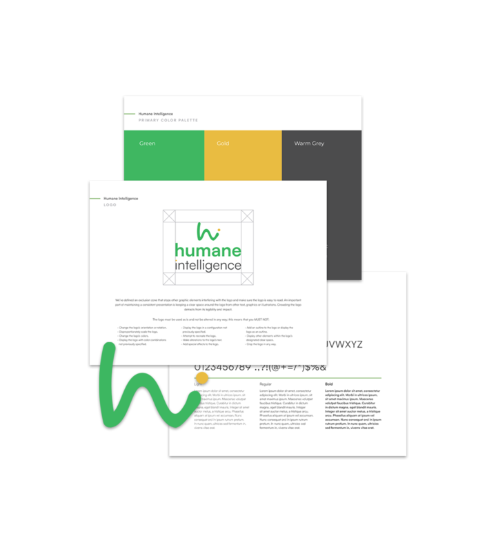
We create a brand usage guidelines and provide you with all the files you need to use your logo going forward. Original Adobe files, digital and print. We provide alternate versions of the logo for use in different contacts, including black and white transparent and web.

Depending on what package you bought, we also create PowerPoint templates, business cards, flyers, billboards, and anything else you can imagine. As the proud creators of your brand we are always happy to work with you creating the assets you need to look amazing in print and web. We can also provide you with the original files sure that you or a third-party designer are able to work with the brand and be sure that it looks as good as it did the day it was born.

Seattle brand development doesn't have to be pretentious, painful or mysterious. We have developed a simple four week process. It's fun and rewarding and it doesn't have to cost an arm and a leg.

The result will be a final product that you love and maybe a little more clarity than you began with when you answer the questions:

What makes my business amazing?

How can I be sure everyone knows?

A logo and the surrounding brand create a feeling. 

They shape how people see you, and show them how you see yourselves.

Your brand becomes a focal point for all your work. For prospective customers, it inspires confidence and showcases your authority. For employees and recruiting, it’s a source of pride and inspiration.

We work with clients to identify the positive emotions that best represent their unique offering, while best positioning their brands in a competitive marketplace.

Studies show that buyers make purchase decisions based largely on emotion.

They compare features and prices — then they tell themsleves, “These guys just feel right. I simply like them better than the others. I don’t know why.”

That's the brand at work. It's a conversion rate multiplier. A megaphone for your story.


"They are outstanding!"

"While going through the process of launching a startup, I needed to find a Seattle branding agency who could develop an iconic brand as well as build an easily navigated and updateable site.

"Bizango took on the challenge and exceeded my expectations. As my company is evolving and our needs change, they are there."

 Justin B, Founder NannySure

What if...

Let's talk about your logo.