
Why Architecture Firm Websites All Look the Same (And What to Do About It)
July 15, 2026
I talk to a lot of architects. Sometimes we talk about design.
As the creative director of a web design agency, I have no illusions: we can't do what you do. You shape physical spaces where people live and work. You work with materials. In three dimensions! We don't do any of that.
Our work is built to last five years if we're lucky.
What we do is smaller than what you do — but it is not a subset. The web is its own medium, with different rules than physical space. We've built our careers learning about how people interact with a specific, transient, 2-dimensional space.
The web is a design language that changes very quickly. And most architects usually haven't spoken this language professionally. These aren't intuitive from the outside, and they're shifting faster than ever.
An architect who understands design at a depth most of us can only admire runs the risk of designing a website that looks beautiful but misses the opportunity.
And what is the opportunity? To persuade a prospective client who has great taste but knows very little about architecture to pick up the phone and give you a call.
This essay is about the thing most architecture firm websites get wrong, and why. The short version: today's buyer is saturated in beautiful photography of the built environment, so your work needs translation. And on the web, translation doesn't happen by adding more photos or writing better captions — it happens through visual storytelling. Let me explain what I mean.
The Web Is A Weird Medium
A building does many things. It shelters, it frames, it orients. It shapes the way people move through space and the way light moves across the floor. Your best work is made of a thousand decisions — about material, about proportion, about what to reveal and what to hold back.
Your clients feel them even if they don't understand. Your structures are spaces meant for living. And working. Gathering and raising children. Full of surprises.
A proper website is not like that.
It has exactly one job: to get a specific visitor to take a specific action. Every floor slopes gently toward the Contact button. Every path has subtly been chosen. We already know how many people are going to click on the About Us page. (About 40%!) (Business.com) We already know how many individual projects they're going to click on and view in depths before deciding. (Generally 2 or 3!) (Contentsquare, 2021)
A proper website has a floor that slopes gently down toward the Contact button.
A website that doesn't move its visitor toward this action isn't working, no matter how beautiful it looks.
Good web design is the art of making that slope invisible — the visitor should feel curious and unhurried, like they're discovering you — but the slope is always there. A website that doesn't move its visitor toward this action isn't working, no matter how beautiful it looks.
Coming from architecture, your training prepares you to create conditions for life. The web asks you to create conditions for a single decision.
Most architects, approaching their own website, bring the instincts of the larger craft to it — let the work stand, let it speak, trust the visitor. Those instincts are right for the physical work. They are wrong for the web.
And here's the other challenge — you already know this but hear me out because it’s generally not reflected in your web designs: When a prospective client visits your site, they aren't architects. They've been scrolling through other architects' sites all morning, and yours looks to them very much like the others. Beautiful structures, beautifully photographed.
They look at your projects and they see beautiful modern homes. They don't see the site constraints you solved, the stakeholder you convinced, the landscape move that made the whole thing work.
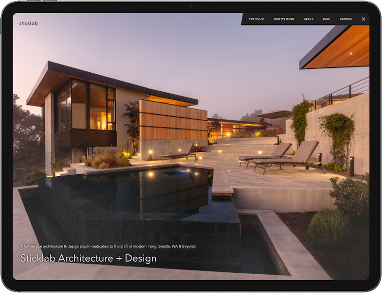
Online, Your Work Needs Translation
Not for other architects. But for the client with great taste and a real budget who has maybe never hired an architect before, who is nervously comparing you to several other firms, and who cannot pick up the phone until they feel a connection to you.
Translation doesn't mean more photos. It doesn't mean cramming more copy into captions no one is reading. A common response to a site that isn't generating calls is to get better project images and do the same thing again with a fresh aesthetic. But this doesn't solve it, because the problem was never that the images weren't good enough. The problem was that images alone don’t sequence. They don’t build. They don’t spark a personal, emotional connection to you and your work. They don’t slope the floor.
What translation actually looks like is the words you already have — or if not the words on the website now, the words you tell us when we ask you what your clients love about working with you. Those ideas, those words buried in captions and customer testimonials, should be doing far more work than they currently do.
Larger, more prominent, more story-bearing. Treated as headlines, not labels. Designed so a visitor scanning the page can move from image to phrase to image to phrase and absorb the whole story without ever reading a full paragraph. Because most of them won't read a full paragraph. But they will scan.
Eye-tracking research from the Nielsen Norman Group has shown for years that most people don’t read most of the paragraphs on a page. They scan. There’s a lot more to it than that, but let’s pick a page on your current site’s portfolio. What are the physically largest words on this page? Are they mere labels, like “Location” and “Our Solution” and “Materials”? Do those words deserve to be the biggest?
Why not pull out more evocative words that have probably already written but which are buried in the paragraphs themselves? Like “A Respect for Place” or “Seeking Symmetry at Multiple Scales” or “A Family with Four Children.”
Words that can be read in the blink of an eye are very different from words in a caption. They will be read. To most viewers, they’re as visual as a photo.
That work is part of visual storytelling. And what architecture firms need is someone who can find the stories hiding in their project descriptions and pull them out so people will read them. Even if, like most of your visitors, they only spend 10-12 seconds on the page. (Nielsen Norman Group, 2011)
Online, translation means getting people to read the words you actually use when you talk about your work.
The words you tell us when we ask you what your clients love about working with you.
Project Names Can Use Verbs
“Madrona Midcentury Modern” tells your prospective client where the project was built and something about it. It’s a label. Useful, maybe, as a place to file all those project photos, if that’s what your website is.
But sometimes that's not enough. What if you named it something like: “A young family discovers beauty on an urban lot.”
Now there are people in the project. There's a problem (urban lot) and a discovery (beauty) and a sense that something happened over time. All before I clicked on it. The story is right there in the title, paired with the photo (which, with its own thousand words, conveys “midcentury modern”).
Or take the project we recently relabeled for one of our architecture clients.
The old caption: “North Shore Community Center.” The new caption: “A community unites around their neighborhood park.”
Same photo. But now the site describes what the firm did, which is bring people together around a shared vision and translate it into space. That second version is the one a prospective client connects with, because it's the work they'd be hiring the firm to do for them too. Notice the verbs. “Discovers.” “Unites.” These titles have action in them. Stories.
And this isn't hard, soul-searching work. Your portfolio is already a collection of stories waiting to be told — you’ve just been labeling them by address. The stories are already yours. You just have to ask the right questions.
Your Best Work Doesn’t Show Up in Photos
The thing that makes you different from another firm with another beautiful portfolio is almost never visible in the photos.
It's the meeting where the client thought they wanted one thing and you helped them realize they wanted something else.
It's the site visit where you noticed how the afternoon light cuts across the lot and reorganized the whole plan around it.
The stakeholder you brought along.
It's the year of advisory work before drawing anything.
It's the listening.
Prospective clients usually aren't sophisticated enough about architecture to reverse-engineer your judgments from photos of the artifact. The thinking that produced the building stays invisible to them unless something on the page surfaces it.
Sometimes the most distinctive work a firm does is hard to photograph.
Early conversations. Feasibility studies. Planning and advisory work.
But it's so valuable to a prospective client trying to find the right architect for what they're facing.
This is especially true for the work that often opens the biggest doors — the early conversations, the feasibility studies, the planning and advisory work.
Many firms barely show this on their websites because it's hard to photograph, or because what exists looks like documents rather than architecture. But sometimes it’s the most distinctive thing a firm does, and it's valuable to a prospective client trying to figure out whether you're the right architect for what they're facing.
Showing the invisible work is harder than showing the buildings. But we have so many tools at our disposal. Pithy client quotes. A well selected candid or informal action shot. Video (which is amazing at conveying momentum). A sketch from early in the project. A few phrases pulled out for emphasis. People. Movement. The raw and informal. Not a lot — just a little. Just enough to set them thinking.
This usually means developing a more flexible project page layout that can adapt to tell different stories — some projects really are about the project photography, but some are partly about how you got there, and your portfolio pages need to be thoughtfully configured for all kinds of media.
The firms that do this well stop looking interchangeable, and start to attract clients who care about the same things you care about.
Everybody Needs a Brand Now
Some architects tend to flinch at the word “brand.” It sounds like marketing to some. Our work should speak for itself.
Twenty years ago, a firm could be known regionally through word of mouth, a few published projects, and a referral network. The work, in that ecosystem, did most of the speaking. Today everyone is online, everyone is broadcasting, everyone is packaging a version of themselves for an audience.
Your (younger) clients are doing it. Your fastest-growing competitors are doing it. And your prospective clients are scrolling Instagram and the web, forming snap impressions in seconds. Many architects can't name their three strongest online competitors. The next generation of prospective clients definitely can.
In this environment, you compete with firms who have figured out how to convey, with visual and verbal flair, what it feels like to work with them.
People hire people. People who feel right.
On the web, “feeling right” is what brand is all about.
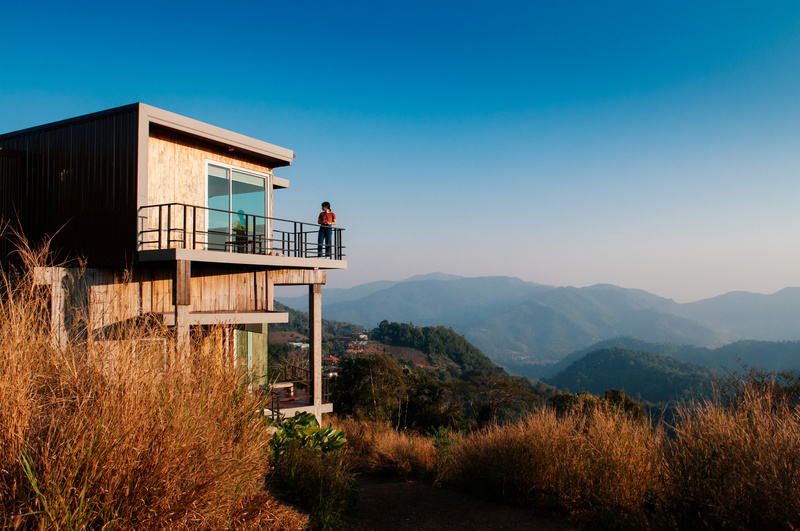
People hire people. People who feel right. And on the web, “feeling right” is what brand is all about.
This doesn't necessarily mean rebranding in the branding agency sense — new logos, brand books, three-day strategy retreats. For most architecture firms, it means something smaller and more findable: naming what you are.
We worked recently with a firm whose work was driven by a quality we kept circling around in conversation — not strict modernism, not warm traditionalism, something in between that felt rooted and unfussy. After a few meetings, the phrase that emerged was “Natural Modern.” Not earth-shattering. But a phrase that gives a prospective client something to recognize, something to remember, something to repeat to their spouse over dinner. “I really liked these people. They do something they call Natural Modern.” That's a brand at work.
We do this a lot... listen to what a firm is saying about how they work, and then pull out the phrases that resonate, that distinguish them from everyone else. The phrases with a little bit of poetry.
Chances are your firm is already using a phrase like this when you talk about your work. You just haven't identified it as branding yet. You just haven't put it on the wall. Maybe it's time!
Yes, You Have to Think About Google and AI Search
SEO can feel like a dirty business. But what good is a beautiful, brand-building website if nobody sees it? Being found is the point.
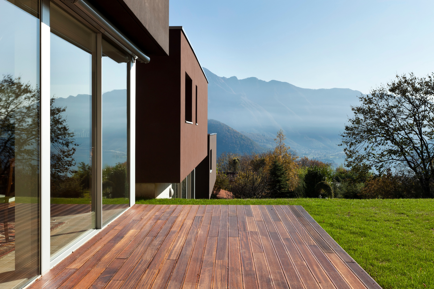
Search engines and human readers actually want the same things from a page:
Clear language, clear services, clear expertise.
Here’s the good news. If you do the work this essay has been arguing for — telling the stories, branding yourselves, surfacing the right words, giving each project a title that moves the heart — Google and AI visibility follows more naturally. Search engines and human readers want roughly the same things from a page. They want clear language. They want to understand your services. They want to understand your expertise. They want important ideas surfaced. The site that scans well for a prospect tends (with a little bit of optimization from the experts) to also be the site that ranks well for the relevant searches, because both audiences are looking for the same signals.
An SEO+AIO specialist should fine tune it — do the research, make the strategic keyword choices, perform the technical optimizations, the small adjustments that move you from page two to page one for the searches that matter.
But if you do the things that make prospective clients connect with you, it’s going to help with Google and AI visibility too.
We’ve written a longer piece specifically on how architecture firms can show up in AI search here.
Before They Pick Up the Phone...
If you've read this far, here's a test you can run in the next ten minutes.
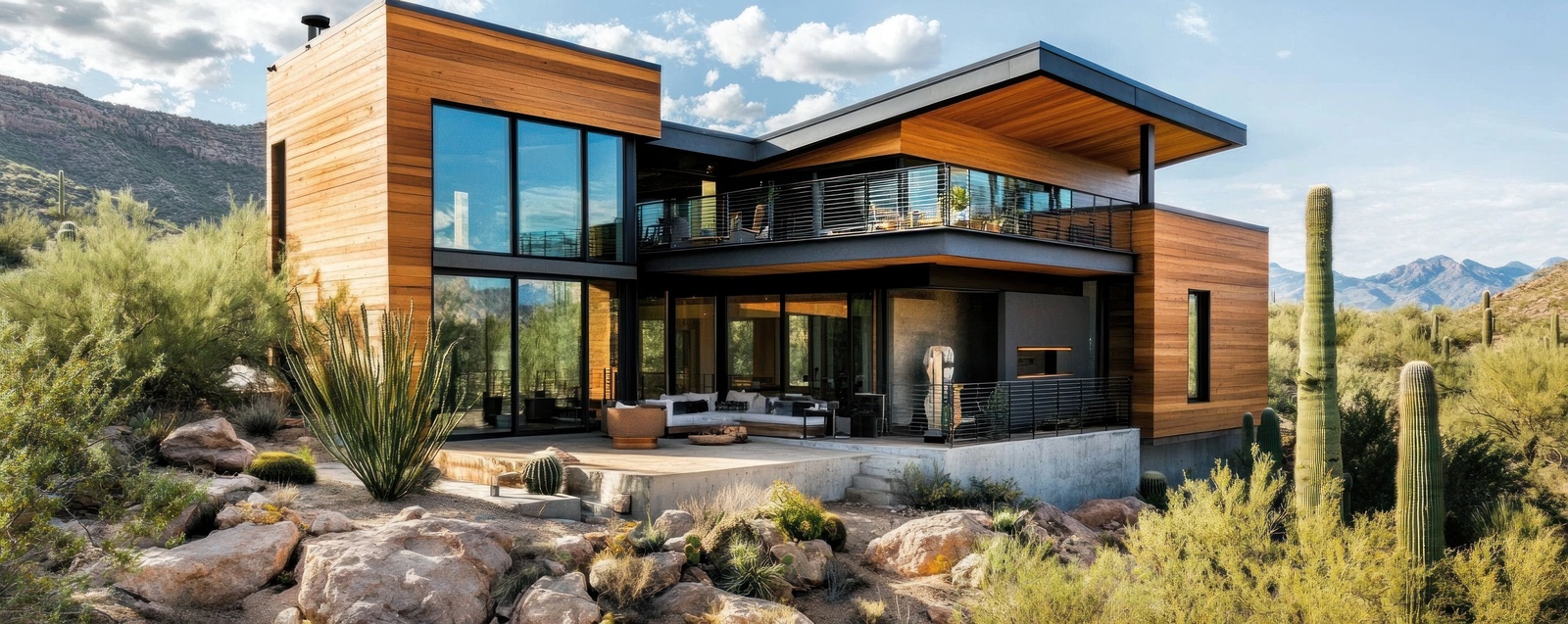
Open your firm's website. Look at your homepage and a few project pages. Just scan. Notice the words your eye lands on first. Notice the words at the largest sizes.
Now ask: does it tell the story of your firm? Does it give clients a realistic sense of what it would be like to work with you? Can they visualize your work together? Can they picture it?
Prospective clients weigh many things when choosing an architect: the work, of course, but also personal chemistry, collaboration, process, the experience of past clients, that intangible electric feeling of yes! This is someone we can work with!
Your website can get them there. Most architecture firm websites speak to almost none of this beyond the portfolio itself. You have an opportunity most of your competitors haven't taken yet.
We all know how valuable it is when a prospective client calls already feeling that connection. They've read your site. They understand you. They're ready to take the next step together.
The architects we admire most are the ones who treat every aspect of their practice as a place where craft and personal attention matter.
Your website is one of those places — maybe the most important, since it's a business investment that will be seen by more people than almost anything else you create. It's an extension of your brand, a place to show people who you are, and to take charge of your reputation. And it’s your chance to help prospective new clients feel comfortable with the way you work, and start visualizing what you might build together.
Make it count.
What If...
Let’s talk about your project.