Essential Elements of
Construction Company Web Design


Updated 2026
Your website may be the first thing prospective clients see when researching your construction company.
If it doesn’t have the essential design elements to keep that person on the page, there’s an excellent chance they’ll hit the back button and visit your competitor.
But what are these ingredients? And how do you know your homepage has what it takes? Here are our six essential ingredients for construction company homepage design.
Construction company web design best practices have come a long way since the days of setting up a wordpress template, adding a few photos, a list of services provided, and your contact information.
These days, your website is an extension of your brand, a sales tool or even a lead-gen tool depending on what kind of builder you are. It is definitely a calling card. A recruiting tool. A proposal reinforcer. It creates awe. And it serves as a multiplier to everything you do.
At Bizango, we have have developed countless successful websites for general contractors, construction companies, and subcontractors. We have learned seven critical elements of great construction website that will capture people’s attention, instill trust, and cause them to trust your company.
These ingredients have been proven again and again and these days, although the implementation is different from site to site, our home page designs generally follow this exact format.
1. The Hook
Studies show that when a prospective client visits a new website, they form their first impression of your construction brand in 1 second or less. That’s just about enough time to absorb a visual graphic and read 5-7 words. In other words, in the blink of an eye.
Am I interested in this site? Do I want to be here? Do these people have what I am looking for? The website visitor is looking for the answer to these questions in the first second.
And construction company marketers know: you better get it right. Because studies further show that a person’s first impression of a brand is extremely challenging to shake. They will often subconsciously equate the quality of the company with the quality of the website.
That's how we’re wired. It’s just the psychological nature of human beings, and this is why great construction company website design practices adhere closely to time-tested psychological principles.
If you don’t give them something awesome, something special, within the first second, chances are your competition will. And they’re gone.
A movie poster moment
Another way to think of the website hook is this. That first impression of the website has to function as a movie poster for your business.
Movie posters are great marketing. Look at a poster for a movie and you immediately know what it’s about. Who are the stars are. What makes it special. Your website hook has to do the same thing for your business. And all without scrolling.
One image. 5 to 7 words. That’s all you need.
Do that – get them hooked – and you buy the next 30 seconds of their attention…
A Word About Clickers and Scrollers
How do you use the web? Do you like to scroll down and read what you've started? Or are you more of a clicker, always looking for the next page?
43% of all viewer time on your site is spent after scrolling down.
You may have heard that everything needs to happen “above the fold” when someone lands on your website for the first time. Well, that’s only partially true. In the era of the mobile device, people do scroll.
It is no longer hard for people to grasp that there is content below the fold. We see it every day on our mobile devices. However—they will only scroll if you immediately capture their attention and they are convinced that you have something to say.
That’s why we call it the hook. Grab attention and don’t let go.
Once we’ve hooked the visitor in the initial first second, they will do one of two things—click or scroll. People are different, and to capture both clickers and scrollers, we offer elements of each. For example:
Clickers—A call-to-action (CTA) above the fold that’s big but not dominating. Plus, clear navigation inside the website.
Scrollers—We offer an engaging story below. Read on...
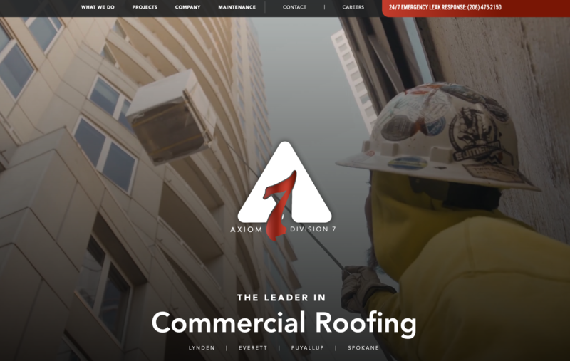
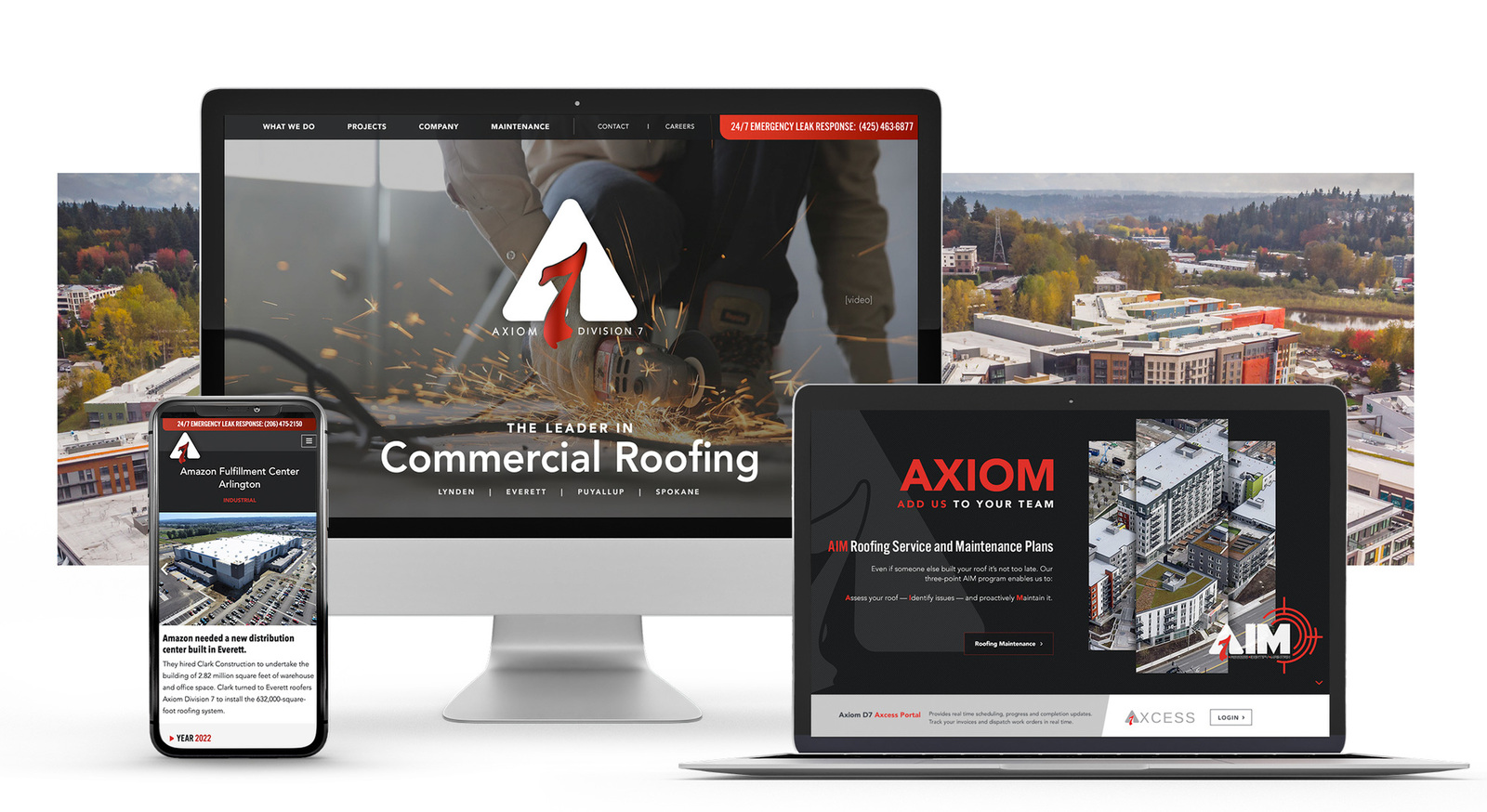
For our client Axiom Construction, we created an exciting video to accompany the words, "the leader in commercial roofing."

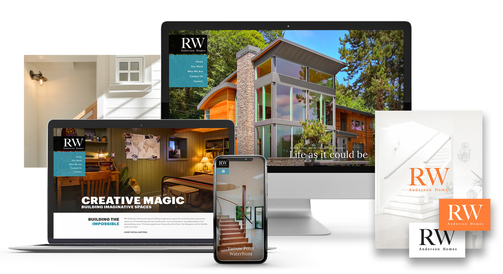
RW Anderson, a custom home builder, features a single photo and the words, "Home as you Imagine" at the top of their top-ranking homepage.
1. Website Checkup: The Hook
Does your website grab attention without scrolling?
Does it show your best work right up front?
Does it serve as a movie poster for your company?
Do you feel proud of what it says about you?
Does it do you all this in less than a second?
If it does then you are ready to move onto the next section.
2. Key Value Proposition
aka Differentiation
The next thing to think about differentiation. In other words, if a prospective client has three website tabs open, we give them a reason to keep scrolling on YOUR website—rather then clicking over to your competitors.
Differentiation means identifying exactly what you and your business are great at. What makes you special? What do you do better than anybody else? What do your best customer say that they love about working with you?
What sets you apart?
- Is it how you go the extra mile in taking care of your clients?
- Is it your award-winning designs?
- Is it the cutting-edge technology that you embrace?
- Your client relationships?
- Your dialed in process?
- Your long track record of success?
- Efficiency?
- Client experience?
But make sure your differentiation is really different.
We work with our clients to dig deep. I really do like asking the question, "what do your best customers say they love about you?" It helps us to get past common differentiators like “value,” and “quality” and “we really listen to you.”
These things may be true of your company! But we run into these things all the time in project kick offs. Everybody says them. And that means they aren’t really different.
After we’ve determined your unique selling proposition, we sit down and collaborate on how we represent that VISUALLY so that we convey the message in a fraction of a second.
We often use icons. You commonly see three icons in a row on a website. This is why. There are other ways to do it. But there is no need to reinvent the wheel.
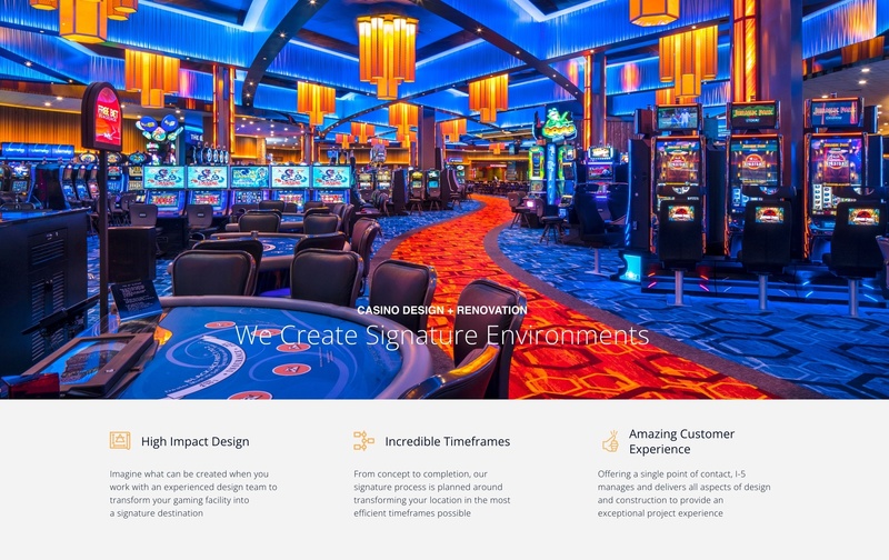
By showing their key differentiators just beneath the opening image, our client, I5 design, a leading casino remodeler, tells prospects what to expect from the I5 experience.

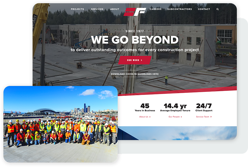
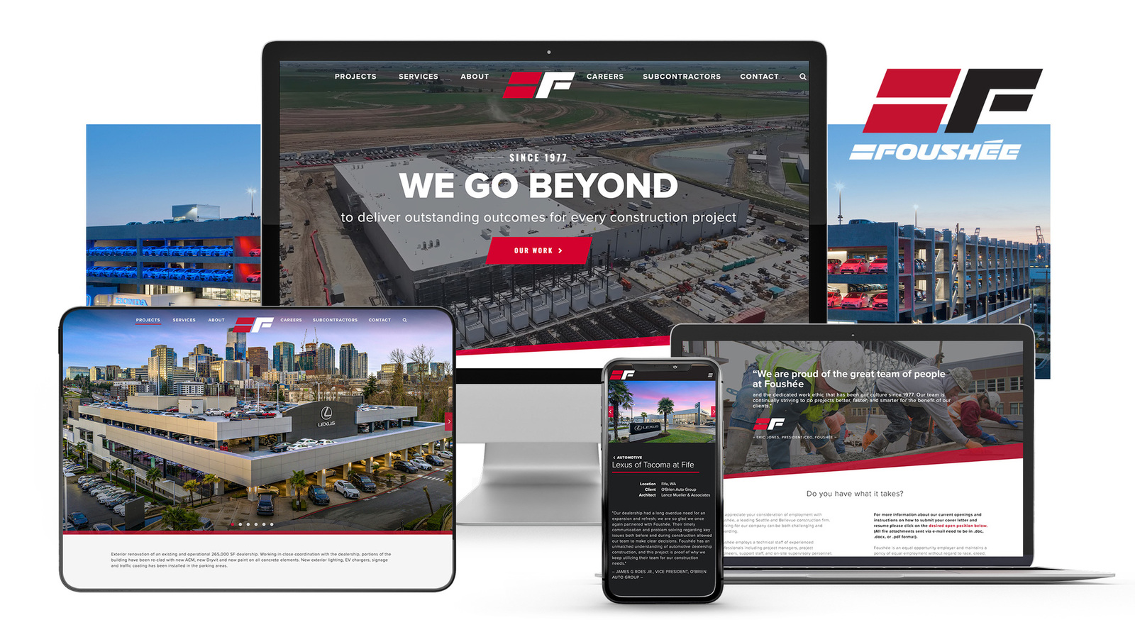
Foushée, a commercial construction company, shares key stats just below the opening image.
2. Website checkup: The Keys
Do you know what is different about your company? Is your website designed to highlight it?
Is it something people care about? Have you looked at your competitors’ sites to see if they are saying the exact same thing?
Have you given prospects a reason to continue on the site? Is it intriguing? Is it something they care about?
Then read on…
3. The Promise
aka the Offer
Now that we’ve grabbed the visitor's attention with something that’s wow, pop, bang, spectacular, we quickly identify who you are and what you offer. People are still impatient at this point, and we need to bring it down to earth very quickly below the fold.
We tell them who you are. What you do. Are you a general contractor focused on commerial work or TI? A home remodeler or custom builder working with homeowners directly?
And we make it fast. Who are you? What specific services do you offer? Where do you work? What clients do you typically work for? How large or small does a project need to be to fit within your process? That’s the promise.
Visitors are looking for that, and if they find it now, after they’ve been hooked, it feeds their enthusiasm, and they will keep scrolling.
For example:
We are a construction website design agency with a 17-year track record of success in helping general contractors and home remodelers take their marketing to the next level.
That text leaves no room for ambiguity about who Bizango is or what we do.
If we caught your interest with that hook, you’ll keep scrolling downwards to learn more about our contractor web design services.
The Promise element of a website is also the best place on the homepage to really take the time to use SEO keywords that the search engines will pick up. But that's a whole 'nother topic!
3. Website Checkup: The Promise
Does your website answer basic questions up front? Does it literally say what it is that you do, who your clients are, and how to reach you?
Does it use the same language that your customers do when descibing what they're looking for?
Is it clear and unambiguous – and SEO optimized – on the homepage?
Then read on...
Talk to a Construction Website Expert
4. The Story
You’ve caught their attention. They’re listening! So, what do you have to say?
The Story element is a chance to tell your website visitors a little bit more about your company. Something that’s special. Something that everyone will take an interest in and care about. Most importantly, something they'll remember.
Maybe you’ll show them a matrix of services, such as bathroom remodels, kitchen remodels, and whole-house remodels.
Or perhaps you have a unique way of providing your services that your competitors can’t match—a really critical differentiator—that warrants more fleshing out.
Alternatively, you can tell a compelling story of your founding, your reason for existing, or your company mission statement—if they’re unusual or unique.
You can also showcase curated projects if they represent the types of project that your visitor cares about (but not unique or weird projects—save those for blog posts further down the page).
This is the place for your finest work. Award winners. The kind of projects you want more of.
When the right prospect comes along, who has the next great project, she can see that that is the kind of work that you do. That is your sweet spot. You’ve done it before, and you can do it again.
This is your chance to give people something to care about. Show them some depth. Set the hook so they can’t pull it out. They’ve scrolled this far...
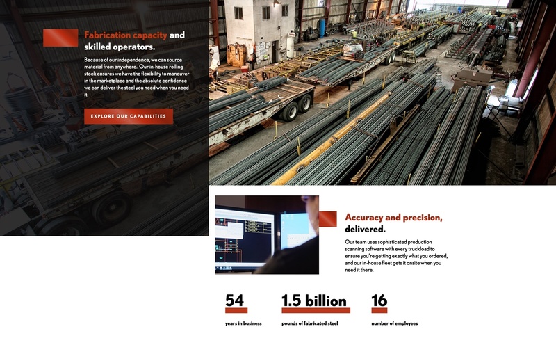
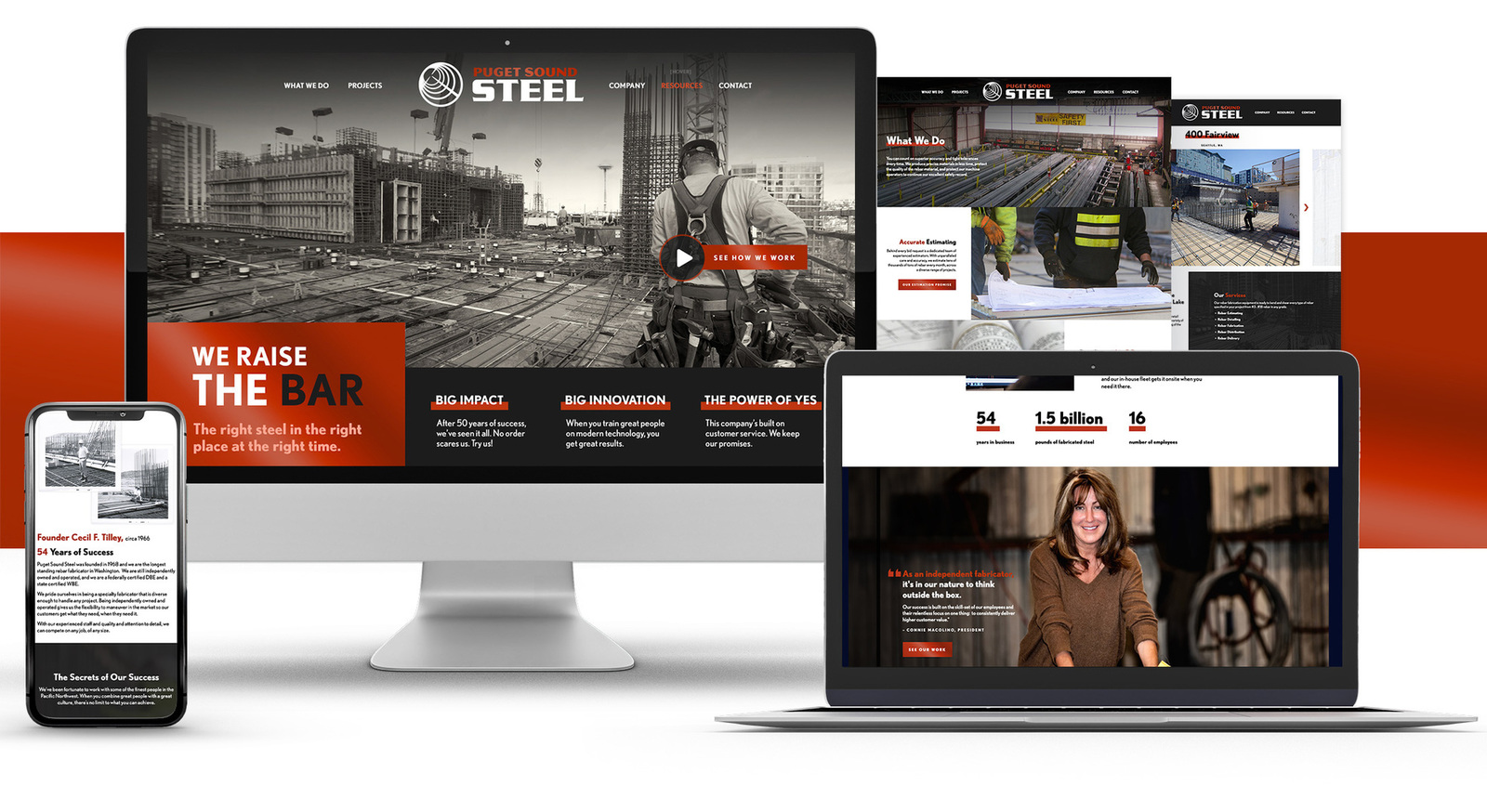
For our client Puget Sound Steel, we told a story of a small company punching above their weight. We shared details about capacity, accuracy, and precision using visceral statistics.
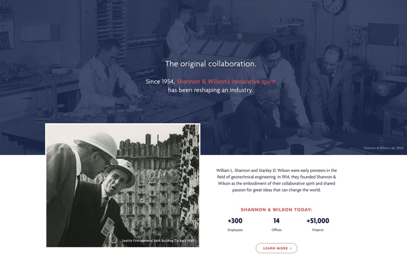
For Shannon and Wilson, we designed a branded panel celebrating their historical founders and significant track record of experience.
4. Website Checkup: The Story
If you have a unique offering have you shared what makes it special? Have you done it in a way that is visual and concise?
Not everyone has something unique that they want to promote. You may have a matrix of services.
Separate kitchen galleries and bathroom galleries for example. If so, are they clickable and enticing? Are they easy to find? Do they lead to pages that are optimized for conversion?
Then you’re ready to continue…
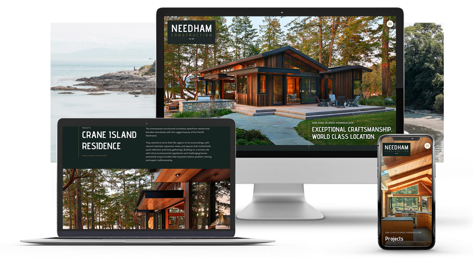
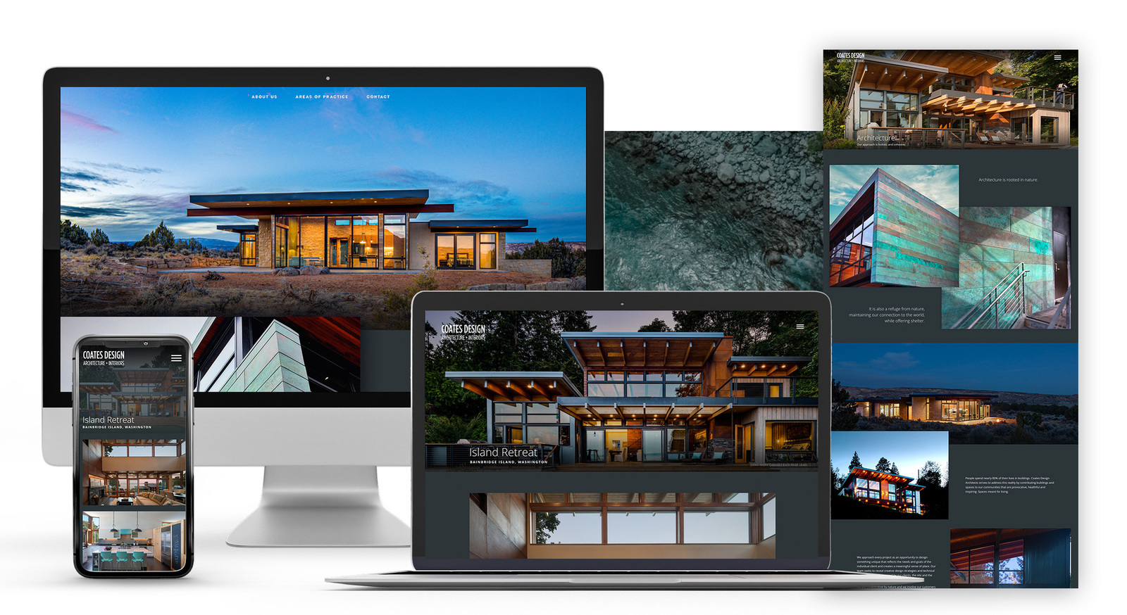
Some of our recent construction company website designs...
5. The Proof
“I’ve been reading all these great things you say about yourself and your construction company. There’s definitely something here. Something that’s really cool. I want it. I want to be a part of it—But I hesitate—After all, this is the internet. Anyone can say anything. How do I know you’re for real?”
Proof and credibility are two essential elements of a construction website. You can to build credibility in several different ways via:
- High review averages from places the reader has heard of (e.g., Angie’s List or Google)
- Client testimonials
- Awards from recognized institutions or places
- Current memberships in known organizations
Running short of actual proof? Maybe you're a new company and have nothing you want to share yet?
Try adding a founder’s message. This is where you need to use a photo where your spouse can say—with a straight face—“yes,” this photo will definitely inspire people to trust you.
Get a good one. Photographers are not that expensive.
Building Trust
When visitors first land on your website, they have no idea who you are. They may have found your site through a Google search, or perhaps someone sent them a link in an email. The Proof section is where you start building trust.
Studies have shown that friends, family, and review sites are still the most trusted sources of brand information. Use them to your advantage, put your best foot forward, and showcase the most glowing reviews that you’ve gotten over the years.
But what if you don’t have any reviews yet?
You can reach out to former clients and ask them if they would be willing to provide an honest testimonial on one of the review sites or a quote that you can attribute back to them. Or even write the quote for them and ask if they'd sign their name to it.
What happens if you can’t find anyone willing to provide a review?
You can always create a few case studies that showcase your previous work. Be sure to include a link to a properly designed case study with ample images and a CTA.
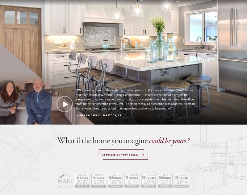
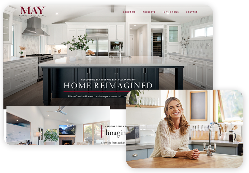
The proof section for respected home remodeler May Construction consisted of a client video testimonial above a row of awards.
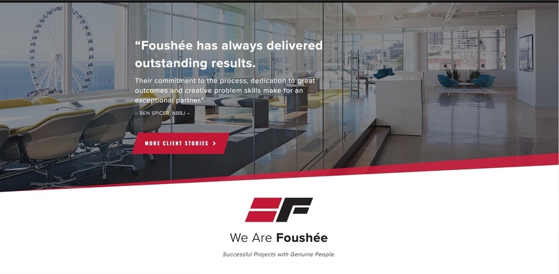
For Fousheé, a single, simple quote from a very prominent architect serves as all the proof they need.
5. Website Checkup: Proof
Have you given site visitors a reason to trust you? Have you shown them it’s not just you saying these great things about yourself but others as well? Does the quoted review refer back to and reinforce the thing you said about yourself at the very top of the page? Then you’re ready for the CTA…
6. The CTA
The one-second rule, key value prop, promise, story, and proof elements have led the website visitor to this exact point—the call to action or CTA.
This is the final and critical step that will cause them to fill out a contact form or pick up the phone to call. But it's not what you're thinking...
Now this might be controversial:
When it comes to adding your contact information and phone number at the top of the home page, it’s not going to drive as many leads as you think. You have to do it. They expect to see it there. But it doesn’t matter how big or bold your phone number is—a new visitor will not call you.
Why should they? You haven’t made your case regarding the value you offer. You haven’t made the sale yet. Do you really think someone is going to contact you as soon as they come to your site? Is this the kind of lead you want?
Have you ever done something like this?
Oh yes, we do add your contact info to the very top – and we can make it really big if it’s important to you – in case someone comes to your website hot off a referral from a previous client, or more importantly, if they are coming to the homepage for the second or third time.
Studies have shown that the top of the website is the first place that people look for contact info—but that is not the most important place to add it.
Usability studies actually tell us that when visitors scroll to the bottom of a page, there is a split second in which they ask themselves, “what should I do next?”
If there’s an enticing button to click, they’ll click it.
That’s why on our client's sites, we make the call-to-action the easiest thing they can do at the bottom of the page. Much easier than moving their mouse back up to the top and closing the browser tab. Much easier than clicking over to the competition.
The same goes for a clickable email address and an easy-to-fill-out contact form that doesn’t require the visitor to fill out ten different fields. Make it easy for them to reach out and start a conversation. What is the minimum amount of information you can ask of them in order to give them a call?
Many sites aren’t even asking for the sale on the homepage. Instead they’re creating a seamless flow of traffic through the site. Maybe the most valuable thing a client can do is click through your project gallery. Or read about your process. They are just getting to know you. There is plenty of time to ask for the sale on gallery pages and deeper within the site.
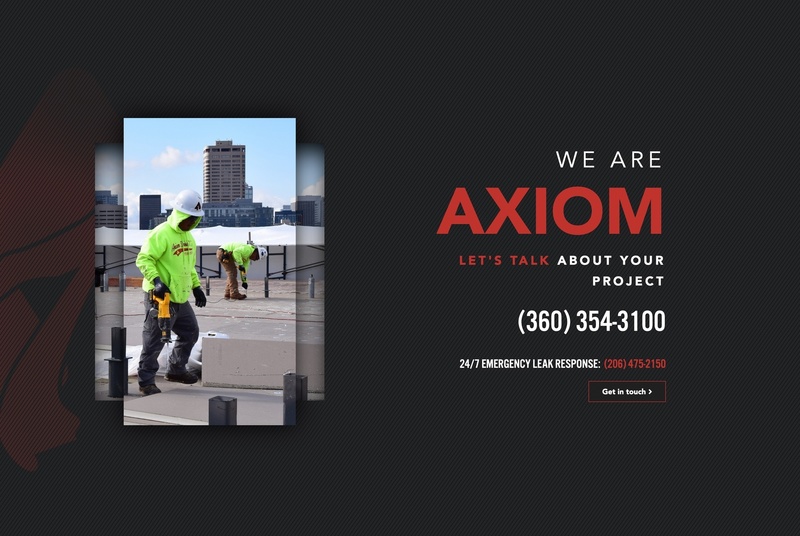
Axiom's big, bold CTA that takes up the whole bottom of the page is very on brand. They kick ass that way.
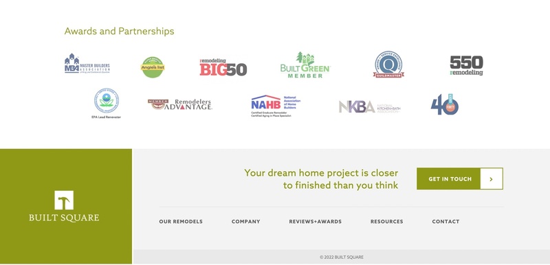
It is great to pair a CTA with a bunch of awards or testimonials. That's just what we did for Built Square.
6. Website Checkup: CTA
Have you got a strong CTA at the bottom of the page? Is it a simple form or an inviting link? Is it the biggest, boldest and easiest thing to do at the bottom of the homepage?
And what about the pages it leads to? Is that going to support everything we have claimed on the homepage?
Does your website inspire action?
A low-performing website inspires about 1% of customers to contact you.
Average is about 3%.
A powerful website converts 6% and higher.
What if your website converted twice as many visitors into leads? What would your project pipeline look like?
The decision-makers on that next great project are looking for quality. Sophistication. Swagger. Confidence.
They’re looking for a builder that gets them - that speaks their language and can prove that they can handle their project with expertise.
Our professional construction websites show your potential customers that you have what it takes and know how to take care of every aspect of their experience.
Let's start a conversation.
Smart SEO brings leads to your new site. An attractive, contemporary design draws them inside. Clear messaging and beautiful construction galleries inspire them to click the "Contact" button and become leads.